Waka Sans
July 12, 2026 • 11 min read
I have loved typography since very early in my web design career. Before responsive design had a name, before variable fonts, before I knew enough to understand how difficult type design really was, I was already obsessed with the invisible decisions that make text feel right.
How long can a line become before the eye loses its connection with the next one? How does line height change the rhythm of reading? Why can two fonts at exactly the same size occupy completely different visual spaces? What do serifs actually do, what does x-height change, and why can a single letter make an entire interface feel serious, soft, technical or cheap? I read studies about reading, perception and the psychology of typography. I experimented with measure, leading, spacing, contrast and hierarchy. The more I learned, the more typography stopped feeling like one part of design.
I always wanted to make a typeface of my own. I also knew enough to understand why I probably would not. I am not a type foundry, and I am not pretending to be a traditional type designer. Drawing one attractive letter is one thing. Building a coherent family is something else entirely. Every decision has to survive the alphabet, multiple weights, punctuation, accents, spacing, kerning, interpolation, italics, file formats and the thousands of combinations nobody thinks about until one of them looks wrong.
The amount of work is mind-blowing.
Then the recent generation of coding models made me curious about a different question: could I use agentic coding to guide the transformation of glyphs with words? Not ask a model to magically “make a font.” That would be meaningless. Could I describe intent, geometry and visual relationships, then use an agent to help translate those instructions into repeatable transformations across a real font system?
That question became Waka Sans.
Starting from zero was the wrong problem
I knew I needed a strong foundation. Starting from an empty glyph set would not just mean drawing letters. It would mean building the entire technical world around them: metrics, interpolation, OpenType features, language coverage, variable axes, naming tables, statics, webfonts and all the small details that separate a typeface from a folder of shapes.
So I started by testing existing open-source foundations. For two days, the process was terrible.
I came close to giving up twice. The fonts I was working from were too far from what I wanted, not only in design but in the way their outlines and variation data were constructed. I could tell the agents to narrow a character, change an angle or correct a stroke, but I could not get the result to hold together visually. A mathematically valid transformation can still produce an ugly letter. A technically correct font can still feel completely wrong.
This is where language reaches its limit. “Make the diagonal more volcanic” sounds interesting to a human and means almost nothing to a coordinate system. Even precise instructions can fail if the foundation does not support the transformation. The agent could move points. It could not automatically understand the optical correction I had in my head. But giving up is so boring.
Then I found DM Sans. What a beautiful typeface, and what a beautiful foundation to work from. It already had the geometric clarity, low contrast, readability and technical depth I wanted. More importantly, it gave me a system strong enough to transform instead of forcing me to spend months recreating solved problems before reaching the part I actually cared about.
That is when the real work began. Waka Sans is openly and deliberately a derivative of DM Sans. I do not want to hide that behind branding or vague language. DM Sans is the foundation, its original copyright remains inside the fonts, and the family is redistributed under the SIL Open Font License, which permits renamed derivatives. Using an existing typeface is not the same as having a point of view. The derivative only becomes interesting when the changes form a coherent idea.
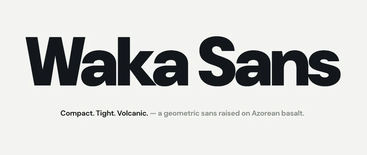
The idea for Waka Sans is compact, geometric and elegant, but with an Azorean basaltic twist. I wanted to preserve the readability and balance of the original while introducing something tighter, darker and more direct. Something that could feel quiet in a paragraph and almost physical in a massive headline.
That became the central idea behind Waka Sans. DM Sans gave me an exceptionally polished geometric system. I did not want to damage that system or change letters simply to prove that I could. I wanted to keep its precision, then introduce just enough tension to stop it from feeling clinically perfect. A narrower structure here. A darker rhythm there. A letter that feels constructed but still carries some pressure inside it.
The Azores are full of this relationship. Black basalt against white walls. Perfect horizons interrupted by volcanic land. Clean geometric architecture built from stone that refuses to be visually clean. The shapes are simple, but the surface contains history, pressure and irregularity. I did not want to decorate the alphabet with a volcano theme. That would become a gimmick very quickly. The influence needed to live in proportion, density, rhythm and selected letterforms. It should be something you feel before you can point to it.
The first concrete changes are deliberately structural. Every non-zero advance width is tightened by 12 units per 1000 em, giving the family a more compact default rhythm without requiring CSS tracking everywhere. The W and w are condensed by 20 percent, but their strokes are rebuilt so they do not become visibly lighter than the neighbouring V and v. That correction has to hold across weights, optical sizes, roman and italic forms. Related kerning also has to be reconsidered because pairs designed for a wide W no longer describe the new letter. This is the part that looks like one small visual decision and becomes a font-engineering problem.
Waka Sans also promotes the alternate g and numeral forms to the defaults, retires the unnecessary stylistic choices, adds tabular figures for real interface and data use, and extends the family with an Ultra 1000 weight. The result is not a random collection of modified glyphs. It is a more opinionated default.
One form. One rhythm. Less negotiation.
Uppercase speaks. Lowercase reads.
There is a clear separation in the direction I want for uppercase and lowercase.
The uppercase needs to set the pace. Simpler, stronger and closer to a poster voice, especially at the heavier end of the family. I want it to work at a scale where a word stops behaving like text and starts behaving like an image. Ultra should feel massive, but because Waka Sans is variable, the same construction also needs to remain convincing when it becomes impossibly thin.
The lowercase has a different responsibility. It has to read. This is not only a display experiment or a font for the Waka identity. I want to use it on websites and in long-running text. That means the lowercase cannot spend all its energy trying to be distinctive. It needs an even colour, clear counters, comfortable spacing and enough personality to belong to the same family without constantly asking for attention.
That tension is the interesting part. The uppercase can be volcanic. The lowercase has to let you live on the island.
Not every character has reached that final separation yet. Waka Sans 1.0 is a real, working family, but it is also the first convincing statement of the system. I am still fine-tuning the letters and deciding where the personality improves the typeface and where it simply gets in the way. Restraint is part of the design. Keeping the perfect imperfect does not mean adding random defects. It means knowing exactly where precision needs a little resistance.
Teaching an agent to see relationships
The most important thing I learned is that agentic coding does not remove the need for typographic knowledge. It exposes it.
An agent can inspect tables, manipulate outlines, rebuild instances and generate files much faster than I could do manually. But it needs constraints. “Make it look better” is useless. “Move these skeletons 20 percent closer while preserving the measured stroke width across every weight and optical-size master” is a problem it can work with. Even then, the first result is rarely the answer. The process is closer to art direction mixed with engineering. Describe the visual problem. Translate it into a measurable rule. Build it across the design space. Render it. Compare it. Find where the rule breaks. Correct the rule. Build everything again. The agent is extremely good at repetition. I still have to decide what deserves to be repeated.
That distinction matters. AI did not give me taste, and it did not make me a type designer in two days. What it did was make a previously impossible personal project reachable. It allowed me to work at the level where I am strongest, intent, systems, visual judgment and iteration while guiding the technical transformations through code.
I was not asking the model to invent my opinion. I was trying to make my opinion executable.
The specimen became part of the design process
Very quickly, I needed more than font files. Looking at a few letters in isolation was not enough, so I built an interactive Waka Sans specimen around the family. It started as a showcase and became a laboratory.
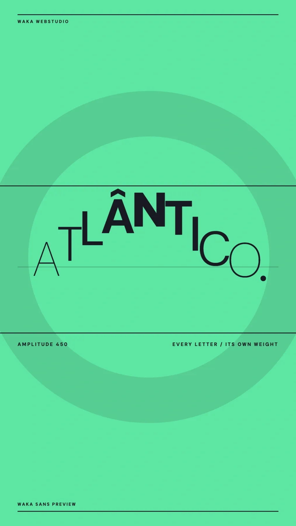
There is a weight wall for all twenty styles, from Thin 100 to Ultra 1000, in roman and italic. A furnace moves through weight, optical size and tracking with one control. A seismograph gives every letter in a word its own weight. The playground exposes the real CSS, OpenType options and variable settings. The glyph furnace lets me inspect 403 characters at any weight. Text ladders test the optical-size axis from small copy to display scale. An inter-island departures table puts the numerals under the kind of pressure they will face in a real interface.
Then I built a poster machine with fifteen generative layouts, four palettes and PNG export. No stock images. No decorative assets. Just Waka Sans, changing weight, scale, rhythm and composition until the type becomes the image. That part is ridiculously fun. The specimen is not separate from the font. It is where I discover what the font is capable of, and where its weaknesses become impossible to ignore. A letter can look beautiful in a glyph editor and fail immediately inside a word. A word can look excellent at 1000 and lose its logic at 100. A numeral can work alone and destroy the rhythm of a table.
Context is where typography tells the truth.
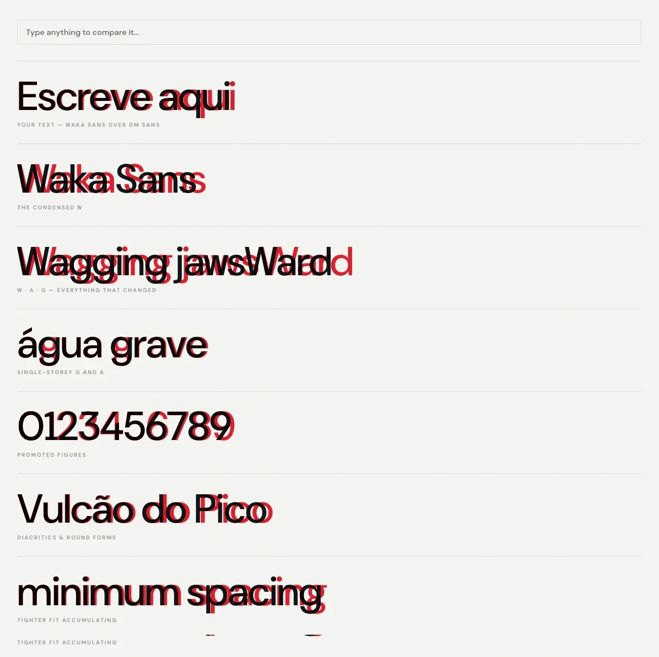
I also built a dedicated Waka Sans × DM Sans difference audit. It places both typefaces directly on top of each other: Waka Sans in ink, DM Sans in red. Wherever the two disagree, the colour leaks out. Weight and optical-size controls update both families at once, and clicking a glyph measures its live advance width. It is part comparison, part measurement tool and part honesty machine. When making a derivative, it is easy to become attached to the story of what you changed. The overlay shows what actually changed. If the red never appears, I have done nothing. If it appears everywhere without a clear reason, I have probably done too much.
Keeping the perfect imperfect
Waka Sans 1.0 is a compact, low-contrast geometric sans-serif with two variable axes: weight from 100 to 1000, and optical size from 9 to 40. It has roman and true italic variable fonts, twenty named styles, Latin Extended coverage, web WOFF2 files, and complete static TTF and OTF families. All of it is generated from a reproducible Python build pipeline. Two original DM Sans variable fonts go in. The naming, metrics, selected glyph forms, features, variable data, static instances, desktop fonts, webfonts and release archive are rebuilt together. That matters because a custom font should not depend on a fragile chain of manual exports nobody can reproduce later.
The repository tells the compressed version of the story: the first variable family and specimen, an interactive overhaul, the DM Sans comparison audit, the poster machine, and finally the first Waka Sans release. Each step created the tool I needed to understand the next problem. And I am still at the beginning. There are letters I want to push further, relationships I want to simplify, and a stronger distinction between the display voice of the uppercase and the reading voice of the lowercase. The difficult part now is not proving that I can change the font. It is knowing when the change makes Waka Sans more itself. That is a much better problem.
Typography still feels like its own world of design to me. The difference is that I finally have a small place inside it that is mine: built on an excellent open-source foundation, guided with agents, tested through code, and slowly shaped by the black volcanic stone I see everywhere around me.
Compact. Tight. Perfectly Imperfect.